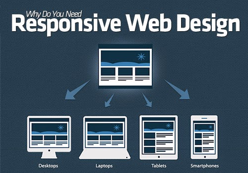
In simple terms, responsive web design is making sure that the design of the website is able to ensure visitors get the best possible reading or browsing experience of the site on every type of device. There are sites that look clear on a cellular or smartphone but look very different when viewed using a tablet. Responsive web design is focused on ensuring that a site adjusts well when viewed from whatever device.
It is very important now because there is no longer just one type of web user. There are now so many ways to go online using so many different devices. As a matter of fact, there are innumerable reports, as well as surveys, which have shown that more and more people are using their mobile phones to go online. When a web design is responsive, it gets around the need to have multiple versions of a site in order to provide for the different shapes and sizes of devices as it responds fluidly to the manner a person is viewing it.
Advantages of Responsive Web Design
The biggest advantage of having a web design that is responsive is that the site is able to provide a user experience that is uniform regardless of whether people view it using a desktop, tablets, or mobiles - all viewers will see a site that has the identical design guidelines. A site that is able to cater to a wider audience ensures better overall user experience. And there is no need to spend money on having multiple versions of the same site to provide for each and every device - one site works for all.
Another very big advantage is that a responsive design saves not only money, but also time. Having just one site which is able to respond to whatever type of device is used to view it does away with the need for having several different versions of the site and this reduces the expenses and time associated with maintaining each and every version of the site.
Having a site with a responsive web design is better for SEO (Search Engine Optimization). Before responsive design, most sites had different versions to cater to different devices - a desktop site version and a mobile version. Although having multiple versions can be effective, it tends to spread a website into as many URLs as there are versions - a regular site (http) and a mobile site (m.) - which puts a site on two different places. Google recommends having just one site in one place and that is possible through having a responsive web design.
Yet another advantage of having responsive web design is that a site will be able to disable content which is desktop only like Adobe Flash-dependent ads on mobile devices as a lot of mobile platforms do not support Flash-based content. This will speed up loading times of a web page considerably which is a major advantage when there is a slow mobile data network - it saves valuable bandwidth for the viewer.
Webzsol.com is a website designing, website development, & internet marketing company based in Mumbai, India. We provide a full suite of services that will function together to give your company a competitive advantage. Our web design, web development and digital marketing services have added value to our client's business services.